Philips AVENT creates products for babies and toddlers. With a roadmap full of connected physical products, Philips AVENT was looking to create a central platform for engaging with their products along with relevant advice.
Getting Started
We worked across stakeholders to define an approach and a strategy.
Before diving into design, we worked with stakeholders across the organization to understand the different players and processes we would need to integrate with. We were then able to plan an approach that would engage everyone with the right content at the right times.
We worked with the core team to establish a strategy of balancing science with emotion while guiding parents through their babies' development. We explored many options at low fidelity for how to bring this balance to the platform, keeping in mind the needs of business stakeholders, the desires of users, and the constraints of a tight development schedule.
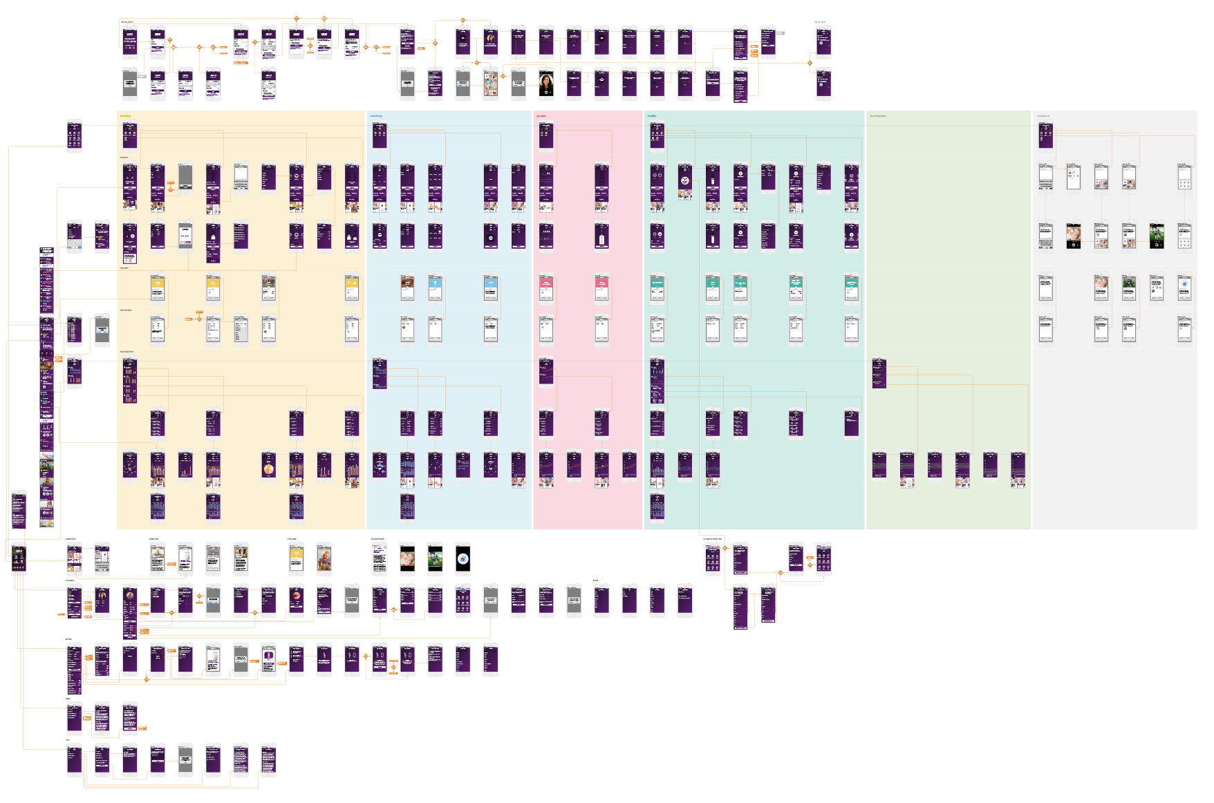
Finding Balance
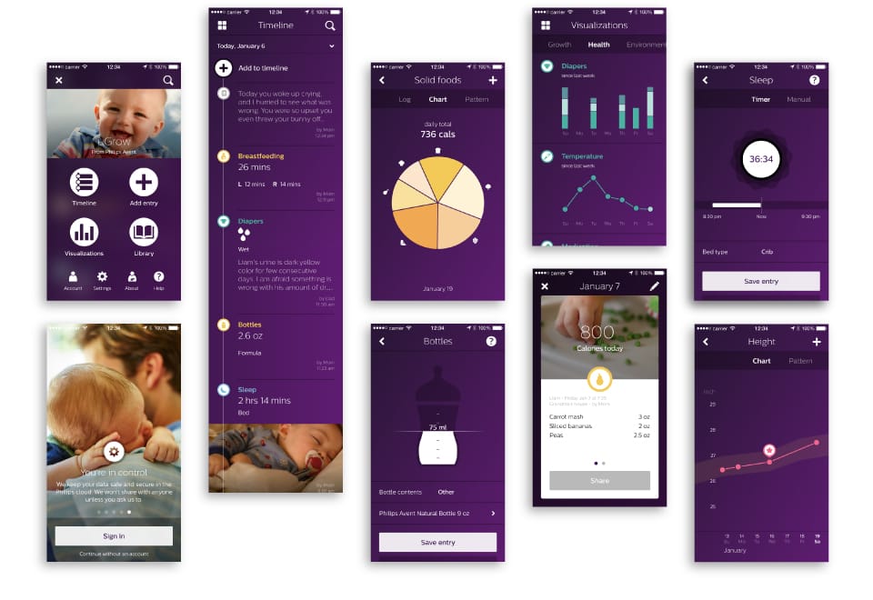
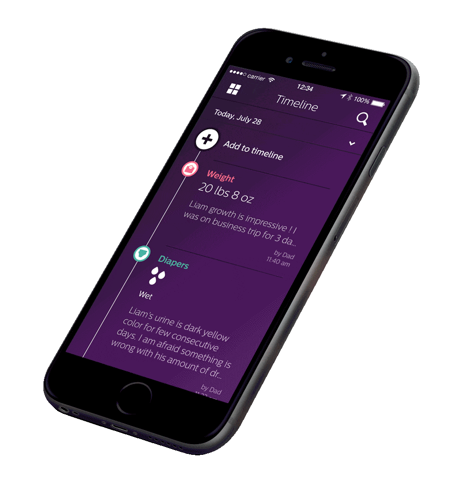
We designed one interface to suit many types of users and needs.
We spent the early weeks of the project reformatting research findings into workshops to inspire stakeholders while aligning on priorities and to gaining commitment.
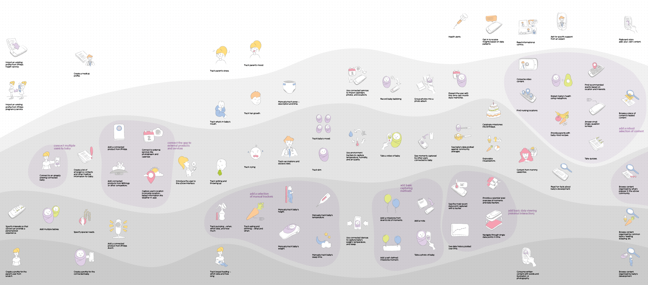
Targeting mothers and fathers of different parenting styles rendered an often conflicted set of requirements. One of the most difficult challenges was designing a multi-faceted app that was easily navigable despite complex relationships between qualitative data, quantitative data, and advice content.
Creating a Language
We created an interface that was true to the Philips brand, finding ways to indicate trust and precision.
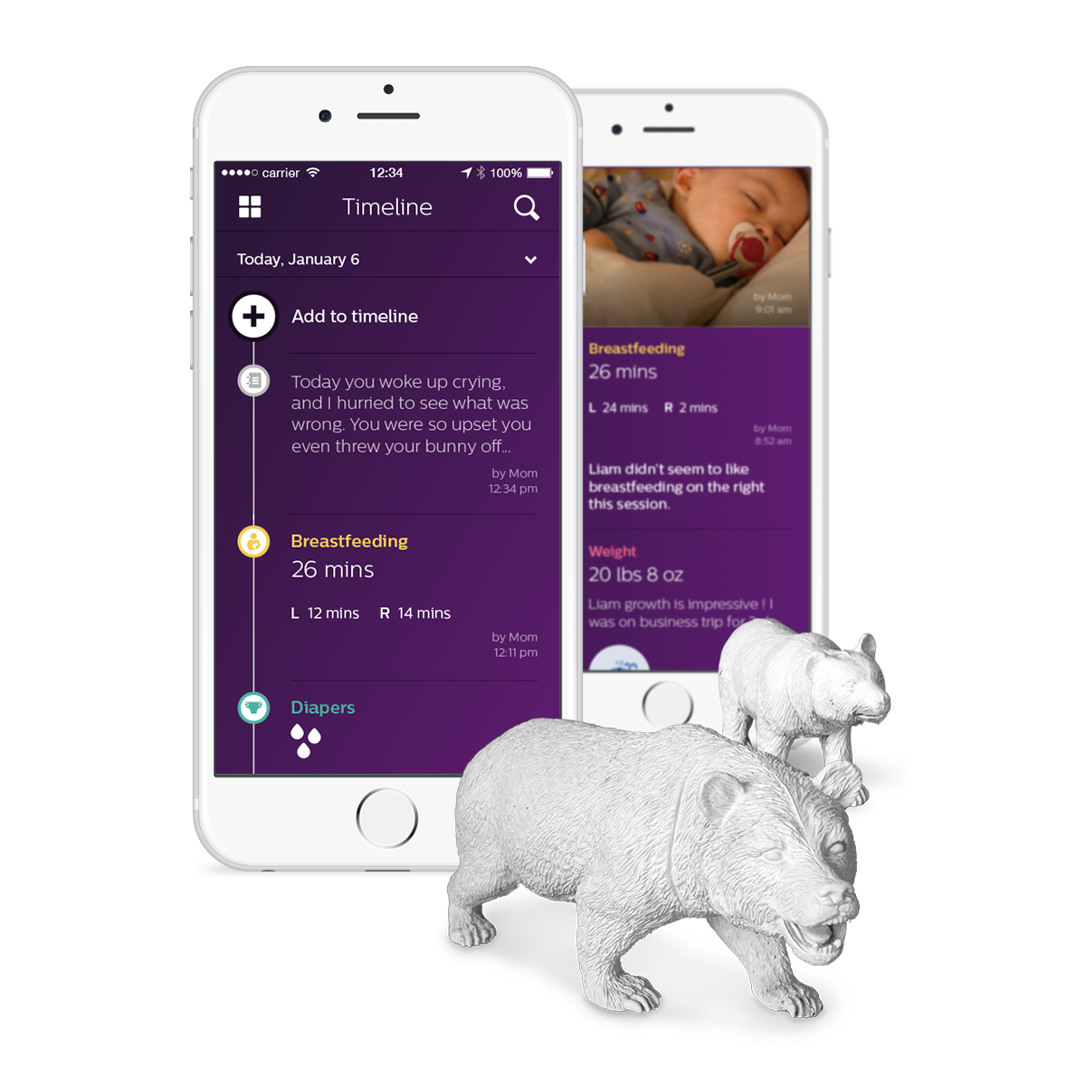
We created a design language that would appropriately show the feeling of baby, while maintaining the professional look of Philips AVENT. The UI conveys trust and precision without being overly technical, and employs user uploaded content to add an emotional layer. Feeling that the UI still needed more delight, we created a handful of novel animations to bring more personality to the experience.
Keeping Consistency
We created documentation to bring consistency to a team in flux.
The project team doubled in size several times throughout the duration of the project, with many people coming and going (some because they were having babies of their own). To minimize the risk of losing the details, we adjusted our process to include lightweight yet comprehensive documentation of screens, flows, and animations.
From the start we kept our work clean and documented our decisions, so that the ultimate handover to the in-house team was easy with minimal disruption.
Team
Creative Director, 2 UX Designers, Technologist
Role
Creative Director
Years
2014–2015