Monolith approached The Artificial in the early phases of their product's development. Over a handful of projects, we established a foundation focused on users’ specific needs, created a language for their product's design, and designed visualizations to highlight the benefits of their product.
We started by exploring multiple options to find the right fit.
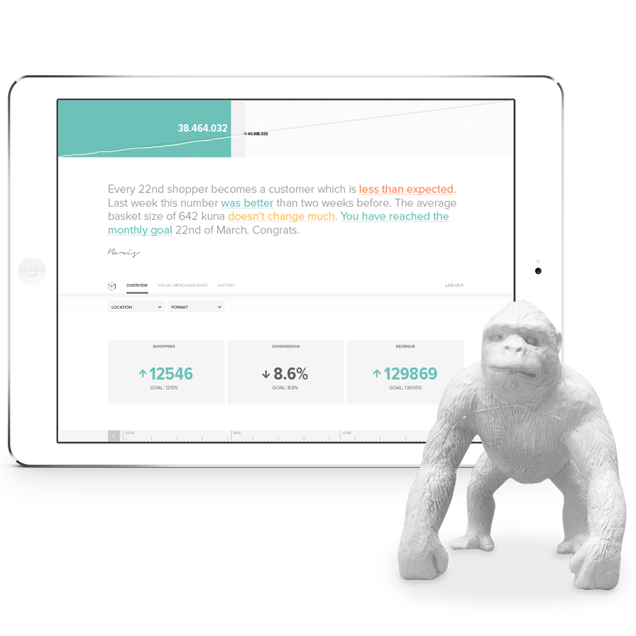
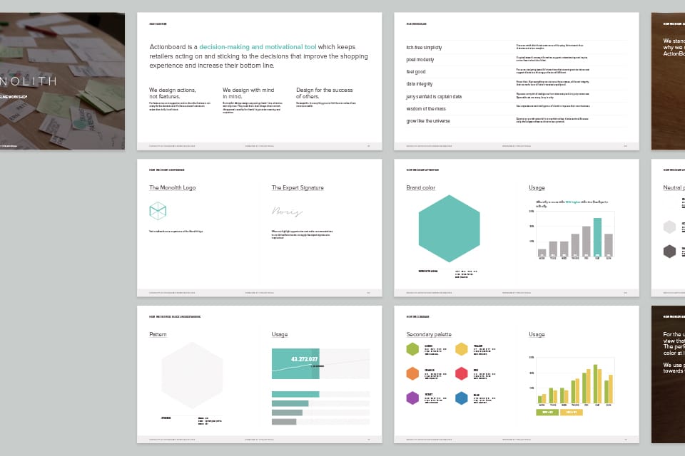
Monolith uses one branded visualization to summarize a retailer's performance. More than a logo or a color palette, this visualization represents their brand. We did a series of quick iterations to explore that combination of value and recognition.
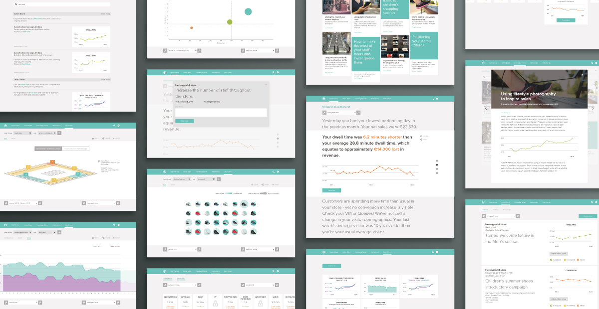
We saught to find and apply consistency across the product's many features and visualizations.
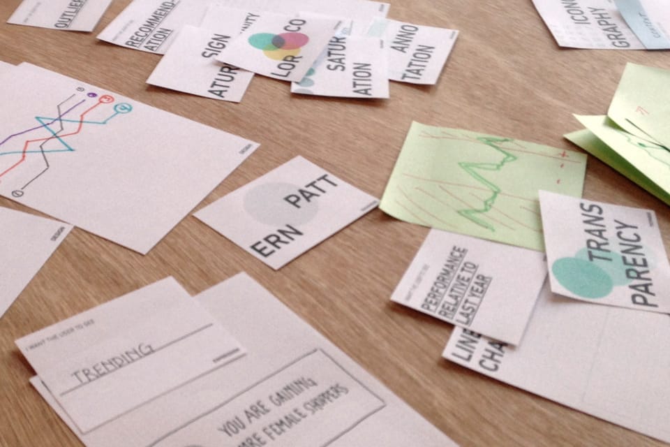
A complicated interface with multiple visualizations can easily confuse users by reusing visual techniques to mean different things. We held a workshop with Monolith to map what they wanted to say with their interface to unique and consistent methods of saying it.
We created and updated guidelines as we went.
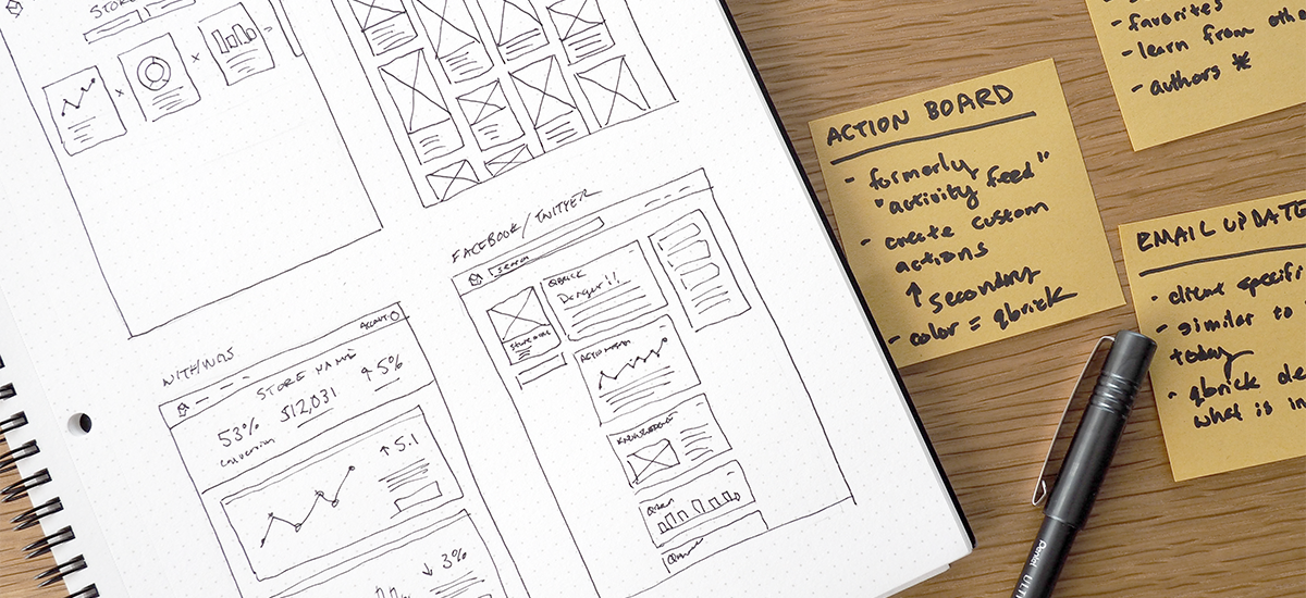
After each workshop, we captured our decisions in a series design guidelines for the in-house designers and developers to apply to the tool. Rather than focusing on concepts like color and iconography, the guidlines were based on concepts like confidence, comparison, and change.
Team
two designers, creative director, technology director
Role
designer + creative director
Years
2014–2017