Animation on the web is hardly new. First there were GIFs, then there was Flash, now there’s HTML5 and JavaScript and GIFs are retro cool. These techniques are great if you want to create dynamic web pages or small raster graphics. But what if you want to create a vector animation that’s lightweight, scales well, and has broad compatibility? These circumstances are ideal for animating SVGs with CSS.
This tutorial is an introduction to the basics of SVG animation with CSS. We’ll start with the basics before moving on to some samples that utilize multiple techniques. By the end of this tutorial, you will have the foundation to create complex animations.
Getting Started
SVG
Scalable Vector Graphics or SVG is a 2D vector image format that scales to look sharp at any resolution. SVG and HTML are peers, and this means that SVG is just as easy to modify and manipulate with CSS.
To create an SVG, you can use design tools like Illustrator, Sketch, or InkScape, or you can write SVG directly using the text editor of your choice.
If you’re using a design tool, make sure you:
- Pixel align elements when possible (avoid decimals for size or position)
- Avoid unnecessary anchor points
- Avoid overlapping elements
- Create your image completely within the artboard
- Export SVG 1.1
 Here is a sample of what your SVG should look like. If you follow these tips, your artwork is almost animation-ready, but you’ll probably still want to clean up your SVG code using a text editor or tool like SVGOMG.
In particular, made sure to:
- Give shapes, paths, and groups you want to animate unique class names
- Make sure your styles are defined within the
styletags (and not on elements themselves)
CSS Basics
Cascading Style Sheets or CSS determines the look and feel of a page in a browser. CSS let you style HTML and SVG elements similarly. CSS syntax consists of a selector to target an element then a property and its value to define the style.
It is possible to declare CSS styles outside an SVG code block in a surrounding HTML page, or in an eternal stylesheet file. To keep things simple in this tutorial, all CSS styles will be contained within the SVG.
While styles can be on the SVG element itself, in our snippets CSS styles are declared within style tags:
<svg version="1.1" xmlns="http://www.w3.org/2000/svg" viewBox="0 0 800 300">
<style>
.mouse { fill: #E5E4E3; }
.tulip { fill: #CC2954; }
</style>
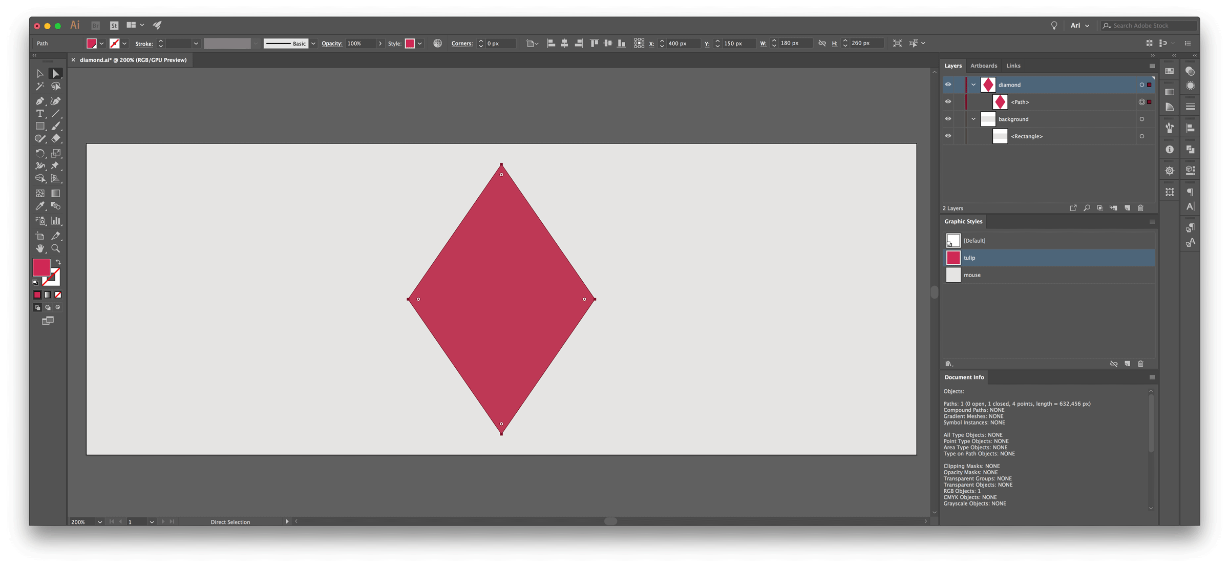
<rect class="mouse" x="0" y="0" width="800" height="300"/>
<polygon class="tulip" points="400, 280, 310, 150, 400, 20, 490, 150"/>
</svg>
Getting Started With Animations
Understanding references and keyframes is essential to animate with CSS. Duration, iteration, easing, and delay are also simple yet useful properties. The MDN web docs are a great resource for examples.
1. References
.diamond {
    animation-name: diamondMoves;
}

@keyframes diamondMoves { }
The animation-name links the animation target to the animations actions.
The animation-name is a key concept, appearing twice. First, the animation name is associated with the target element. Here the target is the diamond class name. Then, the animation is declared with this name within @keyframes. This named animation will hold the list of your animation actions.
2. Keyframes
@keyframes diamondMoves {
    from { transform: translateX(0); }
    to   { transform: translateX(400px); }
}
@keyframes diamondMoves {
    0%   { transform: translateX(0); }
    50%  { transform: translateX(100px); }
    100% { transform: translateX(400px); }
}
The @Keyframes function indicates what should happen at specific moments in the animation cycle. It carries a list of all the steps your target will go through along the whole sequence. Each individual list item is a keyframe rule, containing a time stamp followed by a property and a value.
As shown in the examples above, to specify the state of the target at the beginning and at the end of an animation you can use the keywords from and to. They are equivalent to 0% and 100%. As the second snippet shows, you can add as many keyframes as you need in between the start and the end. These steps play at different times depending on the total duration of the animation, determined separately with the animation-duration property.
Possible keyframes units are:
- keywords
fromandto - percentages, like
0%
3. Duration
.diamond {
    animation-name: diamondMoves;
    animation-duration: 6s;
}
The animation-duration property indicates how long the animation takes to run from start to end.
Possible time units are:
- seconds, like
6s - milliseconds, like
6000ms
The initial value is 0s.
4. Iteration
.diamond {
    animation-name: diamondMoves;
    animation-duration: 6s;
    animation-iteration-count: 1;
}
The animation-iteration-count property indicates how many times the animation sequence repeats.
Possible values are:
- a whole number (integer) or a decimal number like
0,5or1 - the keyword
infiniteto have the animation repeats forever.
The initial value is 1.
5. Easing
.diamond {
    animation-name: diamondMoves;
    animation-duration: 6s;
    animation-iteration-count: 1;
    animation-timing-function: linear;
}
The animation-timing-function property indicates how speed changes along the animation. Easing helps to make animations feel more natural and smoother. You can also apply easing on individual keyframes.
Possible values are:
- the keywords
ease,ease-in,ease-out,ease-in-out,linear,step-start,step-end. - a function, like
frames(5).
The initial value is ease.
6. Delay
.diamond {
    animation-name: diamondMoves;
    animation-duration: 6s;
    animation-iteration-count: 1;
    animation-timing-function: linear;
    animation-delay: 4s;
}
The animation-delay property indicates when the animation starts.
The duration of the delay is specified in time. A positive value delays the start of the animation. 0 makes the animation start directly. A negative value makes the animation start directly as well but it skips the states of the target that were played before 0.
Possible time units are:
- seconds, like
6s - milliseconds, like
6000ms
The initial value is 0s.
CSS Transform Animations
CSS transform animations include rotation, translation, scaling, and skewing. We will see for each of these transform properties an example, a definition, and some possible syntaxes and values.
Before starting to animate a SVG, you should know that the origin point of an SVG element is located at 0, 0 of the artwork. This means by default the reference point from which the transformation occurs is the top left corner and not the center of the artwork. However, CSS transform-origin property lets you change the position of this origin point.
The syntax can use one or two values. The first value is by default for the x-offset, the second value is for the y-offset.
Possible values and units are:
- a length in pixels or in centimeters, like
2pxand2cm. - a keyword or its corresponding percentages
leftor0%,rightor100%,topor0%,bottomor100%, andcenteror50%.
<svg version="1.1" xmlns="http://www.w3.org/2000/svg" viewBox="0 0 800 300">
    <rect class="mouse" x="0" y="0" width="800" height="300"/>
    <polygon class="diamondOr tulip" points="400, 280, 310, 150, 400, 20, 490, 150"/>
    <style>
    .mouse { fill: #E5E4E3; }
    .tulip { fill: #CC2954; }
    .diamondOr {
        animation-name: diamondOrigin;
        animation-duration: 4s;
        animation-iteration-count: infinite;
    }
    @keyframes diamondOrigin {
        from { transform: rotate(0deg); }
        to   { transform: rotate(360deg); }
    }
    </style>
</svg>
<svg version="1.1" xmlns="http://www.w3.org/2000/svg" viewBox="0 0 800 300">
    <rect class="mouse" x="0" y="0" width="800" height="300"/>
    <polygon class="diamondOrCh tulip" points="400, 280, 310, 150, 400, 20, 490, 150"/>
    <style>
        .mouse { fill: #E5E4E3; }
        .tulip { fill: #CC2954; }
        .diamondOrCh {
            animation-name: diamondOriginChanged;
            animation-duration: 4s;
            animation-iteration-count: infinite;
            transform-origin: 50% 50%;
        }
        @keyframes diamondOriginChanged {
            from { transform: rotate(0deg); }
            to   { transform: rotate(360deg); }
        }
    </style>
</svg>
Rotate
The rotate animation moves an object circularly around a point.
The rotate animation is written rotate(a), in which a is an angle composed of a value and a unit. The angle defines the amount of rotation. It is composed of a value followed by a unit. A positive value makes the rotation go clockwise and a negative value makes the rotation go counterclockwise.
Possible angle units are:
- degrees, like
90deg - turns, like
1.5turn - radians, like
1.64rad
<svg version="1.1" xmlns="http://www.w3.org/2000/svg" viewBox="0 0 800 300">
    <rect class="mouse" x="0" y="0" width="800" height="300"/>
    <polygon class="diamondTu tulip" points="400, 280, 310, 150, 400, 20, 490, 150"/>
    <style>
        .mouse { fill: #E5E4E3; }
        .tulip { fill: #CC2954; }
        .diamondTu {
            animation-name: diamondTurns;
            animation-duration: 4s;
            animation-iteration-count: infinite;
            transform-origin: 50% 50%;
        }
        @keyframes diamondTurns {
            0%   { transform: rotate(0deg); }
            50%  { transform: rotate(-90deg); }
            100% { transform: rotate(0deg); }
        }
    </style>
</svg>
Translate
The translate animation moves an object from one point to another based on the coordinates given.
The syntax can use one or two values. It can be written translate(tx) or translate(tx, ty), in which t is a length composed of a value and a unit. Along the x-axis, a positive value makes the object move right, and a negative value makes the object move left. Along the y-axis, a positive value makes the object move down, and a negative value makes the object move up.
Possible length units are:
- pixels, like
200px - percentages, like
50%
<svg version="1.1" xmlns="http://www.w3.org/2000/svg" viewBox="0 0 800 300">
    <rect class="mouse" x="0" y="0" width="800" height="300"/>
    <polygon class="diamondMo tulip" points="400, 280, 310, 150, 400, 20, 490, 150"/>
    <style>
        .mouse { fill: #E5E4E3; }
        .tulip { fill: #CC2954; }
        .diamondMo {
            animation-name: diamondMoves;
            animation-duration: 8s;
            animation-iteration-count: infinite;
            transform-origin: 50% 50%;
        }
        @keyframes diamondMoves {
            0%   { transform: translate(0, 0); }
            20%  { transform: translate(0, -200px); }
            30%  { transform: translate(0, 0); }
            40%  { transform: translate(0, 200px); }
            50%  { transform: translate(0, 0); }
            60%  { transform: translate(-200px, 0); }
            70%  { transform: translate(0, 0); }
            80%  { transform: translate(200px, 0); }
            100% { transform: translate(0, 0); }
        }
    </style>
</svg>
Scale
The scale animation resizes an object.
Scaling can either keep the object ratio intact, or it can distort it if the horizontal and vertical scaling amounts are different. The syntax can use one or two values, written scale(sx) or scale(sx, sy), in which s is your amount of scaling. Your value can be a whole number (integer) or a decimal number. A value bigger than 0 and smaller than 1 shrinks the element, and a value over 1 enlarges the element.
<svg version="1.1" xmlns="http://www.w3.org/2000/svg" viewBox="0 0 800 300">
    <rect class="mouse" x="0" y="0" width="800" height="300"/>
    <polygon class="diamondSc tulip" points="400, 280, 310, 150, 400, 20, 490, 150"/>
    <style>
        .mouse { fill: #E5E4E3; }
        .tulip { fill: #CC2954; }
        .diamondSc {
            animation-name: diamondScale;
            animation-duration: 4s;
            animation-iteration-count: infinite;
            transform-origin: 50% 50%;
        }
        @keyframes diamondScale {
            0%   { transform: scale(0.5); }
            50%  { transform: scale(1.5); }
            100% { transform: scale(0.5); }
        }
    </style>
</svg>
Skew
The skew animation transforms an object along an oblique angle. It distorts each point of the SVG element that is not directly located on the x-axis and on the y-axis by a certain angle in the horizontal and vertical directions.
The syntax can use one or two values. The skew animation can be written skew(ax), skew(ax, ay), skewX(a), or skewY(a), where a is an angle composed of a value and a unit. The amount of skewing is defined by the values of an angle. The greater your value is, the most distorted your object is.
The value is followed by a unit.
Possible angle units are:
- degrees, like
90deg - turns, like
1.5turn - radians, like
1.64rad
<svg version="1.1" xmlns="http://www.w3.org/2000/svg" viewBox="0 0 800 300">
    <rect class="mouse" x="0" y="0" width="800" height="300"/>
    <polygon class="diamondSk tulip" points="400, 280, 310, 150, 400, 20, 490, 150"/>
    <style>
        .mouse { fill: #E5E4E3; }
        .tulip { fill: #CC2954; }
        .diamondSk {
            animation-name: diamondSkew;
            animation-duration: 4s;
            animation-iteration-count: infinite;
            transform-origin: 50% 50%;
        }
        @keyframes diamondSkew {
            0%   { transform: skew(0); }
            25%  { transform: skew(-35deg); }
            50%  { transform: skew(0); }
            75%  { transform: skew(35deg); }
            100% { transform: skew(0); }
        }
    </style>
</svg>
Other CSS Animations
Aside from transform properties, CSS animations also include color fill, fill mode, stroke animation, opacity changes, and animation direction. We will see for each of these animations one example, a definition of the animation, and its possible values.
Color
The color of an object is defined by the fill property.
Possible values:
- a keyword, like
pink - a color code, like RGB
rgb(204, 41, 84), RGBArgba(204, 41, 84, 0.5), or hex like#CC2954
<svg version="1.1" xmlns="http://www.w3.org/2000/svg" viewBox="0 0 800 300">
    <rect class="mouse" x="0" y="0" width="800" height="300"/>
    <polygon class="diamondCo tulip" points="400, 280, 310, 150, 400, 20, 490, 150"/>
    <style>
        .mouse { fill: #E5E4E3; }
        .tulip { fill: #CC2954; }
        .diamondCo {
            animation-name: diamondColor;
            animation-duration: 4s;
            animation-iteration-count: 1;
        }
        @keyframes diamondColor {
            0%   { fill: #CC2954; }
            100% { fill: #F2F230; }
        }
    </style>
</svg>
Fill Mode
The animation-fill-mode property defines the first state of your object at the beginning of the animation and the last state of your object at the end of the animation.
Possible values:
noneforwardsapplies the value of the last keyframe at the end of the animation. It can be influenced byanimation-directionandanimation-iteration-count.backwardsapplies the value of the first keyframe at the beginning of the animation. If ananimation-delayis set, the target will keep the value of the first keyframes until the animation starts. It can be influenced byanimation-directionas well.bothapplies the value of the first keyframe at the beginning and the value of the last keyframe at the end of the animation.
The initial value is none.
<svg version="1.1" xmlns="http://www.w3.org/2000/svg" viewBox="0 0 800 300">
    <rect class="mouse" x="0" y="0" width="800" height="300"/>
    <polygon class="diamondFi mouse" points="400, 280, 310, 150, 400, 20, 490, 150"/>
    <style>
        .mouse { fill: #E5E4E3; }
        .tulip { fill: #CC2954; }
        .diamondFi {
            animation-name: diamondFillMode;
            animation-duration: 4s;
            animation-iteration-count: 1;
            animation-fill-mode: forwards;
        }
        @keyframes diamondFillMode {
            0%   { fill: #CC2954; }
            100% { fill: #F2F230; }
        }
    </style>
</svg>
Stroke
The stroke attribute defines the color of an object line.
Possible values:
- a keyword, like
pink - a color code, like RGB
rgb(204, 41, 84), RGBArgba(204, 41, 84, 0.5), or hex like#CC2954
The default value for the color of the stroke attribute is none.
Stroke has several other properties such as stroke-width for the thickness of the line, stroke-linecap for the appearance of the edge of the line, and stroke-linejoin for the appearance of the angles of the line.
The stroke-dasharray defines the look of a stroked path. It indicates the length of the dashes and the length of the gaps in between the dashes. The stroke-dashoffset defines the space before the first dash location. The values of these two properties should be lengths.
Possible length units are:
- no specified units, like
2 - em, like
2em - pixels, like
2px - percentages, like
20%
<svg version="1.1" xmlns="http://www.w3.org/2000/svg" viewBox="0 0 800 300">
    <rect class="mouse" x="0" y="0" width="800" height="300"/>
    <path class="diamondSt pathTulip" d="M400,280l-90-130l90-130l90,130L400,280z"/>
    <style>
        .mouse { fill: #E5E4E3; }
        .pathTulip {
            fill: #E5E4E3;
            stroke: #CC2954;
            stroke-width: 10px;
            stroke-linejoin: round;
            stroke-linecap: round;
            stroke-dasharray: 1000;
            stroke-dashoffset: 1000;
        }
        .diamondSt {
            animation-name: diamondStroke;
            animation-duration: 4s;
            animation-iteration-count: infinite;
        }
        @keyframes diamondStroke {
            0%   { stroke-dashoffset: 1000; }
            50%   { stroke-dashoffset: 0; }
            100% { stroke-dashoffset: 1000; }
        }
    </style>
</svg>
Opacity
The opacity attribute defines the amount of translucence of an object.
The possible values are :
- a whole or a decimal number from
0transparent to1opaque, like0.2. - a percentage, like
20%.
<svg version="1.1" xmlns="http://www.w3.org/2000/svg" viewBox="0 0 800 300">
    <rect class="mouse" x="0" y="0" width="800" height="300"/>
    <polygon class="diamondOp tulip" points="400, 280, 310, 150, 400, 20, 490, 150"/>
    <style>
        .mouse { fill: #E5E4E3; }
        .tulip { fill: #CC2954; }
        .diamondOp {
            animation-name: diamondOpacity;
            animation-duration: 4s;
            animation-iteration-count: infinite;
        }
        @keyframes diamondOpacity {
            0%   { opacity: 1; }
            50%  { opacity: 0.1; }
            100% { opacity: 1; }
        }
    </style>
</svg>
Direction
The animation-direction property defines the reading direction of an animation. This property is used to easily create loops.
Possible values are the keywords:
normalto play the way described in the keyframesreverseto play the animation backwardalternateto alternatively play forward and backward at each iterationalternate-reverseto alternatively play backward and forward at each iteration
The initial value is normal.
<svg version="1.1" xmlns="http://www.w3.org/2000/svg" viewBox="0 0 800 300">
    <rect class="mouse" x="0" y="0" width="800" height="300"/>
    <polygon class="diamondMoBa tulip" points="400, 280, 310, 150, 400, 20, 490, 150"/>
    <style>
        .mouse { fill: #E5E4E3; }
        .tulip { fill: #CC2954; }
        .diamondMoBa {
            animation-name: diamondMovesBack;
            animation-duration: 4s;
            animation-iteration-count: infinite;
            transform-origin: 50% 50%;
            animation-direction: alternate-reverse;
        }
        @keyframes diamondMovesBack {
            0%   { transform: translate(0, 0); }
            100% { transform: translate(200px, 0); }
        }
    </style>
</svg>
This animation iteration is set to infinite, and the animation direction is set to alternate-reverse. That is why the animation is looping even if the start and end keyframes are not similar.
Common Uses
Hover States
Hover states usually indicate to a website visitor using a pointing device that an element is interactive. CSS animations are very convenient to create animations when the user hovers on SVG elements. CSS easily allow changing the color of a button, scaling the clickable element, or even morphing an icon to another shape.
At to [icon], for instance, hover states use the CSS scaling property on SVG. (To [icon] is our site for high-quality icon series.)
In this example you can hover on the icons to see them change color.
Logo Animations
Making a logo dynamic can make it feel more memorable, playful and unique. Find below an example of the animated logo for our connecting things project.
Illustrated Animations
CSS animations can give life to your vectorial illustrations. You may think about animating line drawings, or looping sceneries whether they are abstract or figurative. Find below an animation for our 3 number, originally designed for the 36 Days of type challenge.

Conclusion
Not every web animation is right for SVG with CSS, but it’s a powerful combination. It is a lightweight and future-proof technology, broadly supported on web browsers. Straightforward expressions offer so much control over time, transformations, and styles. We wish you very good luck creating your own! Don’t hesitate to send us your feedback on this tutorial, or to share your creations.
For more examples based on the basic concepts of this tutorial, you can visit our CodePen collection.